When I was hired to be the first in-house designer for Temple’s Student Activities Department, one of my first projects was to develop a marketing package. The client was looking to unify the brand image, and present more professionally in a way that was appropriate for a big state school.
I created a thorough brand kit, complete with brand pillars, style guide, and best practices for merchandise, social media, and other official documents. I’ve assembled a couple curated collections of slides from that presentation below.
Logo Redesign
Before developing the brand kit and style guide, I was tasked with redesigning the logo. The head of the department thought the old logo was too busy (I agreed) and wanted to simplify it. When I was hired, my first assignment was to create a stripped-down version of the logo.
Since the brief was more about simplifying than redesigning, I tried not to reinvent the wheel. The department head was explicit that she wanted the logo to still be recognizable. I kept this in mind when simplifying.
The old logo was trying to incorporate all the different branches of Student Activities, but it was a bit cluttered. I removed everything but the actual name. I kept the focal point of the old logo to keep it recognizable, and changed the colors to Temple’s cherry and white (or cherry and black, depending on which version of the logo I was using).

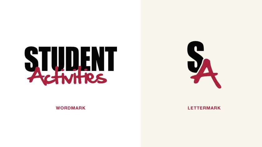
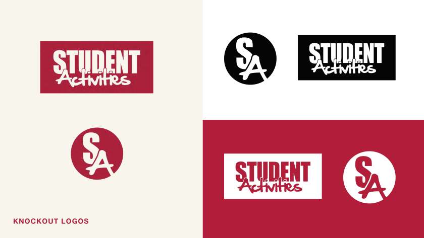
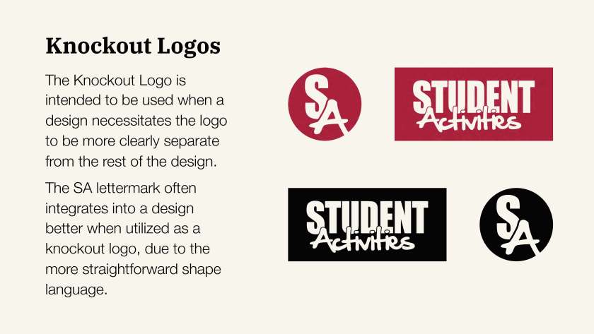
After my success with redesigning the logo, the department head asked me to develop a full brand kit. I developed logo variants for the wordmark, as well as a lettermark and knockout versions of each. This was important for implementation across platforms and media, as Student Activities produces a lot of content and merchandise, and I needed to make sure there was a logo that could work for any context. (You can read more about that in the full presentation)


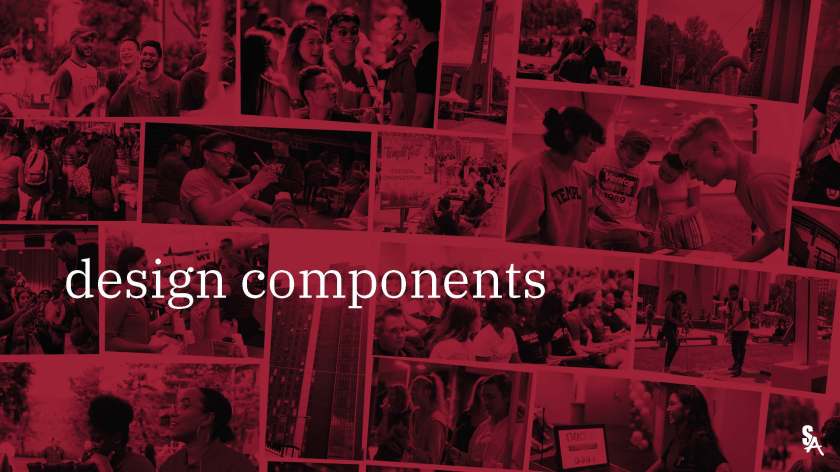
Style Guide
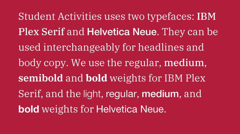
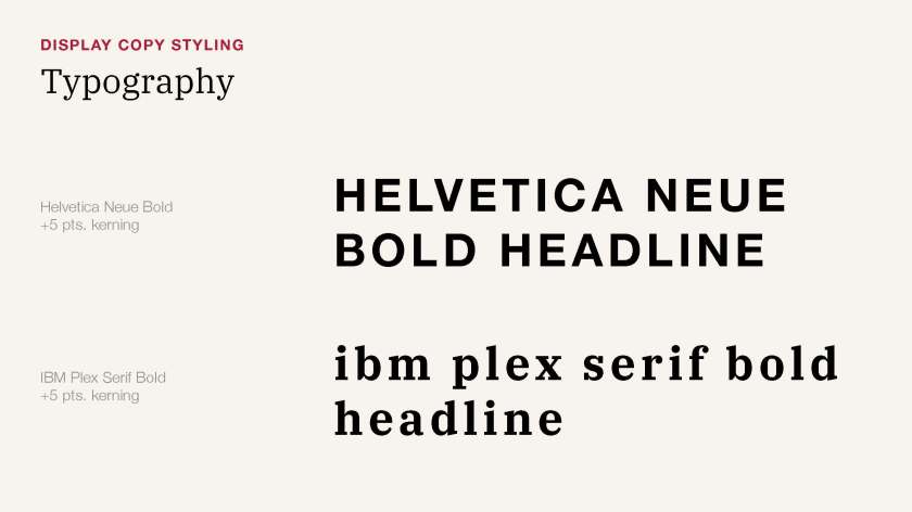
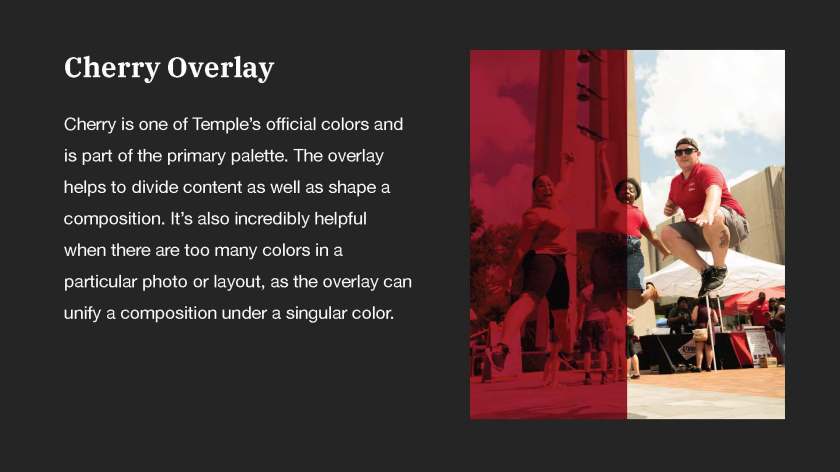
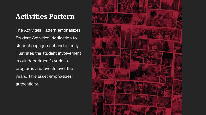
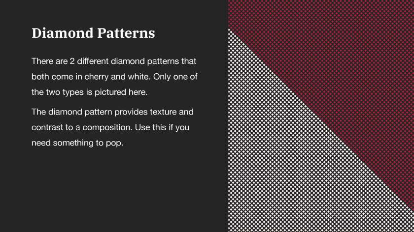
The style guide was developed to provide the other employees in the department (namely, branches that did not have in-house designers) with ground rules for marketing materials. By creating this we would have a consistent brand image, and would be able to ensure that no matter who made a graphic or social post, it would still look like the Student Activities brand. The color palette was based around the Temple Style Guide’s color palette with one or two additions.


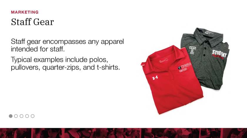
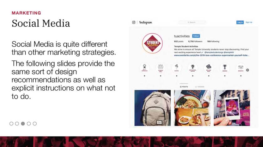
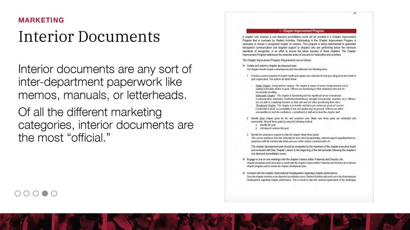
Best Practices
Finally, I included a section in the presentation regarding execution in marketing. Staff Gear, Giveaways, Social Media, Interior Documents, and Exterior Materials all had their own section of approved logos, recommended colors, and typography. This again ensured that the Student Activities brand could be unified across platforms and media.