STUDENT WORK
These are some of my favorite graphic design projects I did non-professionally, either for school, as a project for a friend, or otherwise.
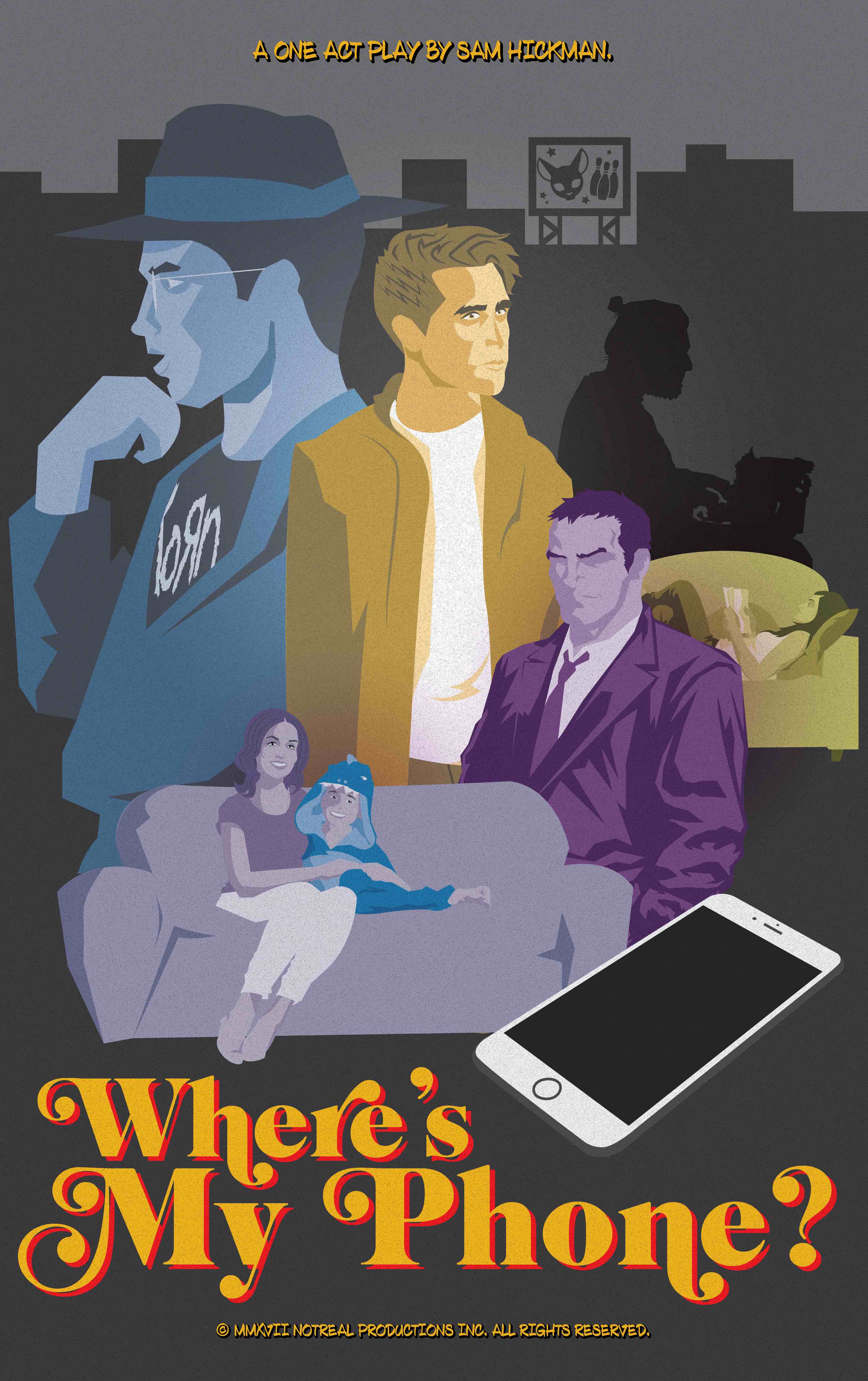
“Where’s My Phone?” Poster Design
Dec 2015 | Recolored Jan 2020
This was a one-act play that a friend of mine wrote and directed. It’s about a guy who loses his phone at a bowling alley and then goes on an absurdly life-threatening and dramatic wild goose chase to recover it. It’s ridiculous, and it won the SPHS One Act Play Festival in 2016. After the festival, my friend asked me if I would design a poster for it. I happily obliged and created this.
I wanted to create a very dramatic-looking composition, something you’d see on an old movie poster. I went for a cross between a Drew Struzan style layout and a colorful Quentin Tarantino-esque aesthetic. I wanted to achieve a very serious looking poster for what is quite frankly a very silly play.
I really enjoyed playing with typography and composition on this project. I think the man in the Korn t-shirt and the individual with the typewriter in the background both lend a sense of drama and intrigue that captures the play’s farsical suspense.
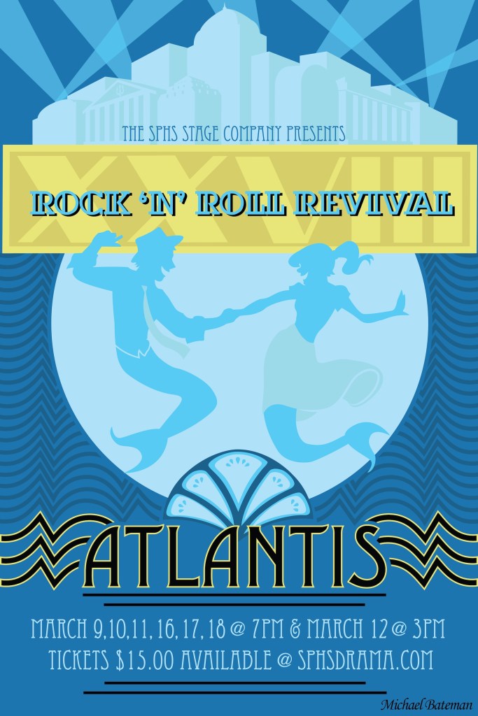
Rock ‘n’ Roll Revival XXVIII Poster Design
Feb 2016
This was the winner of the RNR XXVIII poster design contest, becoming the official poster and t-shirt design for the show.
When designing this piece, I wanted to harken back to the show’s roots while very clearly conveying that year’s selected theme. I’d been going with my family to see Rock ‘n’ Roll since I was in elementary school, so it was very important to me that the history and legacy of the almost thirty-year old show was represented in my design. I ended up building the composition around two dancing mermaids, posed similarly to the dancing sock-hop couple from the original Rock ‘n’ Revival poster, to help tie the show’s history into that year’s underwater theme.
Out of concern that an overly-undersea aesthetic would come off too gimmicky, I decided to go with an art deco design, which influenced the type and other design elements. I particularly enjoy the subtle Atlantean architecture at the top, I think it says “Atlantis, with style.”
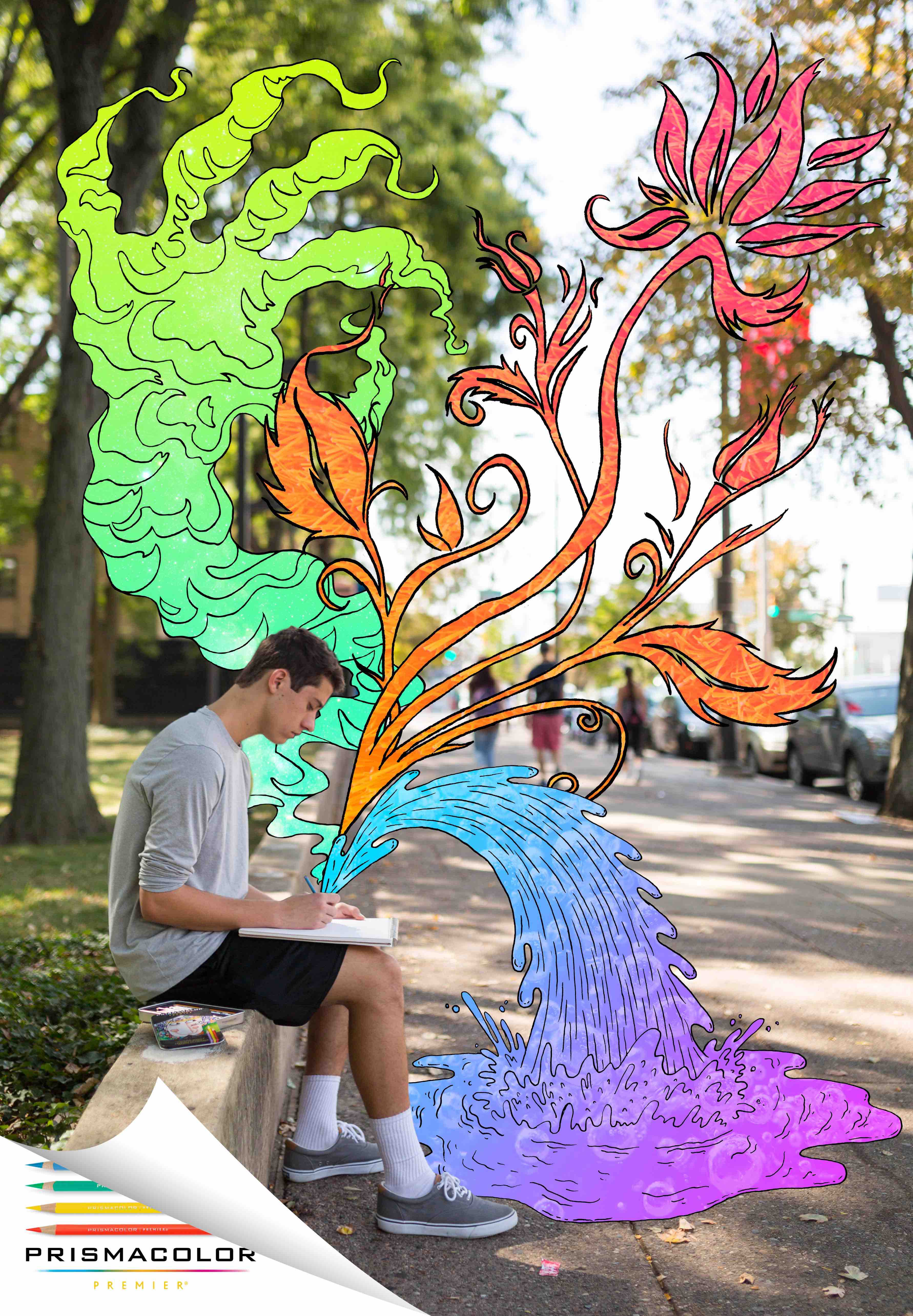
Prismacolor Ad Project
Oct 2017
This was a project for one of my Art Direction courses when I was studying Advertising at Temple. The brief was to design a print or out-of-home ad for an existing brand. Being the art hobbyist that I am, I chose a brand that I am quite fond of: Prismacolor.
The idea behind the composition was that when you use Prismacolor pencils, your art leaps off the page. I envisioned colorful, psychedelic designs flowing from the pencil tip. I wanted to do something mixed media to really play into the contrast between real life and the world of art and imagination.
I took the photo myself outside my dorm, and sketched out the designs on paper, coloring them digitally. The final composition was put together in Photoshop.
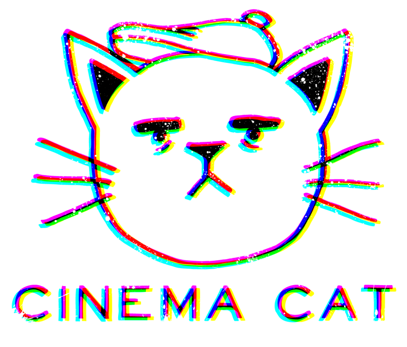
Cinema Cat Logo Design
Mar 2019
This started out as just a little practice sketch, but I was so enamored with the facial expression on this little guy that I had to finish the idea.
The idea for this logo design originated from a graphic design project a friend of mine was working on for school. His assignment was to come up with a fictional company to design a logo for, and then design that logo. He came up with this hipster-y film production company called “Cinema Cat.”
After seeing him working on his logo, I had my own ideas about how I would approach it, and ended up sketching this cat in a director’s hat. I took a photo of it and pulled it into Illustrator to clean up. I really had fun playing with the RGB effects. I think the offset colors give off a very edgy movie-nerd/special effects vibe. Also, that cat’s expression is just priceless.