Great Big Digital Agency is a boutique agency that helps companies improve their online presence through both technical and creative means. They pride themselves on being the intersection between the left and right brain, and that intersection rests at the core of their brand image.
In the summer of 2020, I joined the team at Great Big Digital Agency as a Creative Intern. I was initially brought on board for the summer to refresh their brand and create custom illustrations for their website, but I ended up staying on through the end of the year. I spent the fall designing marketing materials, designing graphics for their YouTube channel and working as a web designer on client projects.
I talked with the CEO Josh Silverbauer and CCO Pete DiLorenzo at great length about how they viewed their brand and how they wanted it to be perceived. In developing the branding, I wanted to focus on duality, and the balance between their two distinct services: Data and Creative. This meant showing the sophisticated, tech-y side of the brand without being too clinical or cold. Complex yet playful was the desired goal. (Personally, I think we pulled it off.)
Logo Redesign
Once the brand pillars were established, I began the logo development. This entailed selecting a color palette and type family, as well as designing a primary wordmark, lettermark, and favicon.
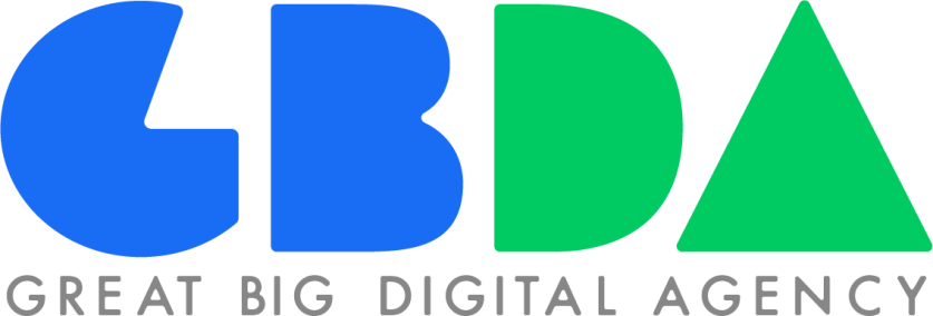
GBDA used to stand for Grue & Bleen Digital Agency, and the blue/green duality has been present within their branding from the very beginning. When I talked to Pete and Josh, it seemed very important to keep that element, both out of recognition of the Brand History and because it does a good job of communicating duality.
I went through many iterations of color and shape language, trying to find the perfect balance between playful and professional. Even the slightest imbalance would make the brand come off too childish or too clinical. The final wordmark is below. The lettermark and favicon were developed later.
Illustration
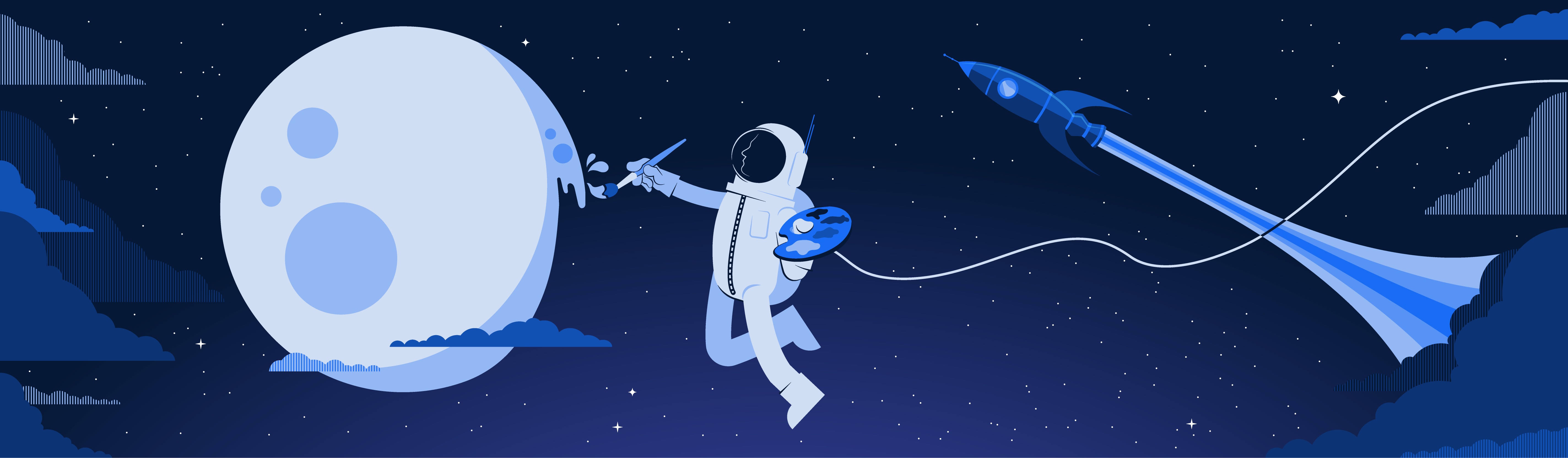
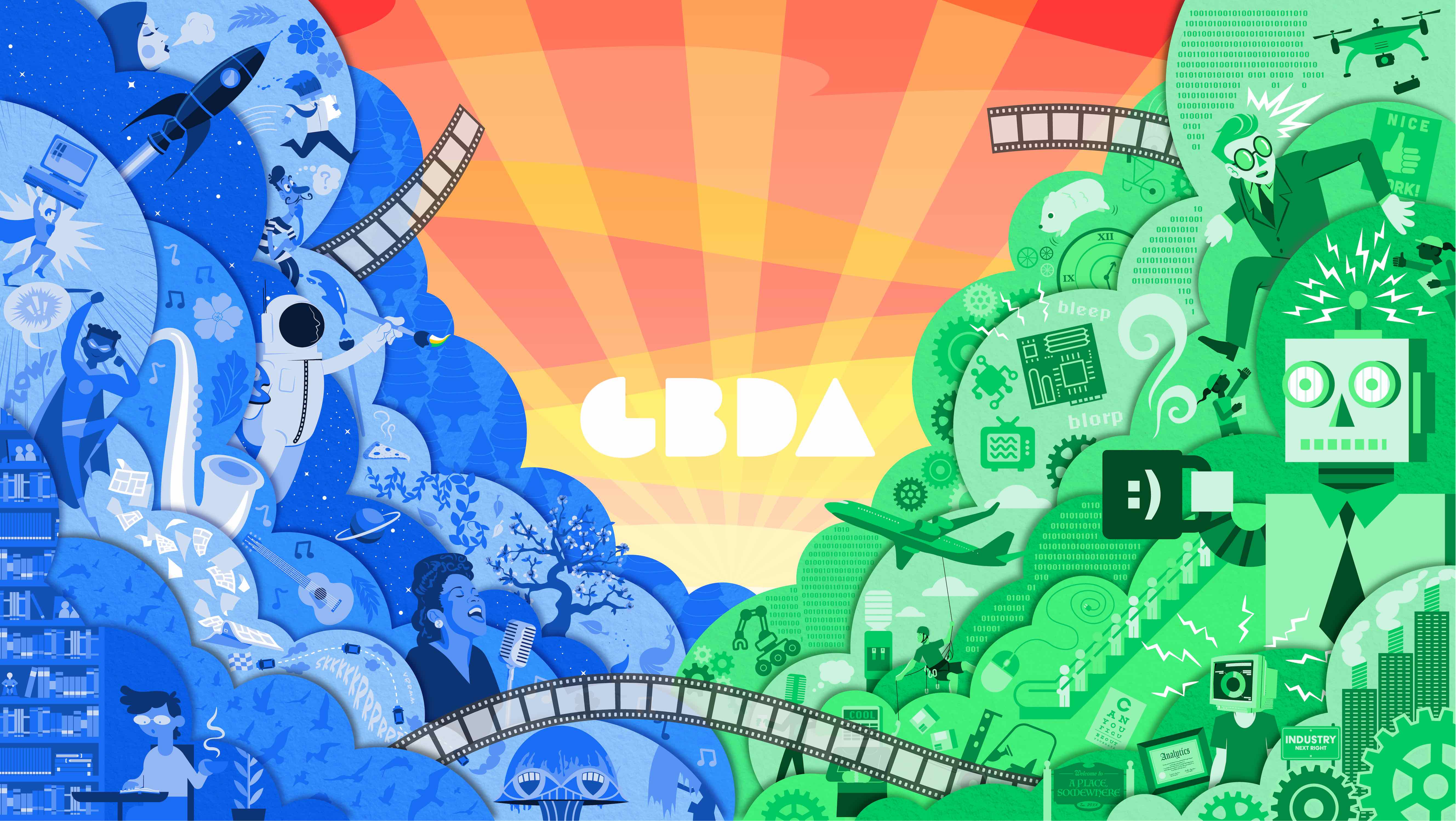
After locking down the logos and color palette, I was tasked with developing assets for the website. GBDA wanted to move their brand image away from photography, and focus more on custom illustration. Their branding in the past had been primarily photo-heavy. Illustration could be more expressive, more evocative, and more abstract, which were all limitations with photo-based design.
The illustration development process started with Pete giving me a concept like “Analytics” or “Team,” which I would then further ideate on, creating a custom illustration. My semi-surreal, colorful designs ended up really leaning into their “no idea too strange” philosophy. I created the compositions below in Adobe Illustrator.


YouTube Thumbnails
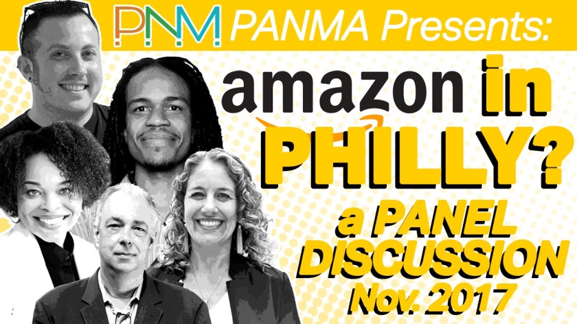

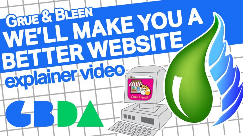

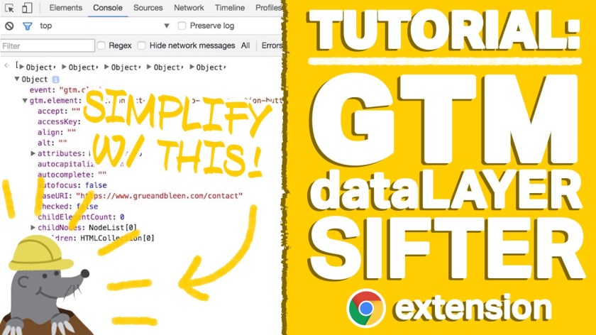
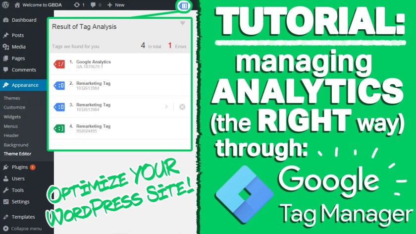
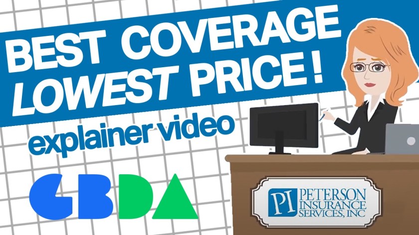

In addition to branding and design work, I also helped out with digital marketing. One of my big tasks I took on was developing YouTube thumbnails for their lengthy back catalog of videos, ranging from explainer videos for previous clients, to web developer/web design tutorials, to recordings of live events.
Noticing a pattern, I decided to develop a language for the thumbnails. I would still try to be loyal to the color palette (client explainer videos were the exception), but created a few different layouts for thumbnails that I would use for each type of video. If it was an explainer video, it would have different images and text, but would have a layout similar to previous explainer videos. The same was true for tutorials, events and seminars.
I thought a more unified look gave their YouTube page a greater sense of professionalism than before.
